DESIGNING FOR BREXIT
Investigations into Brexit's impact on design
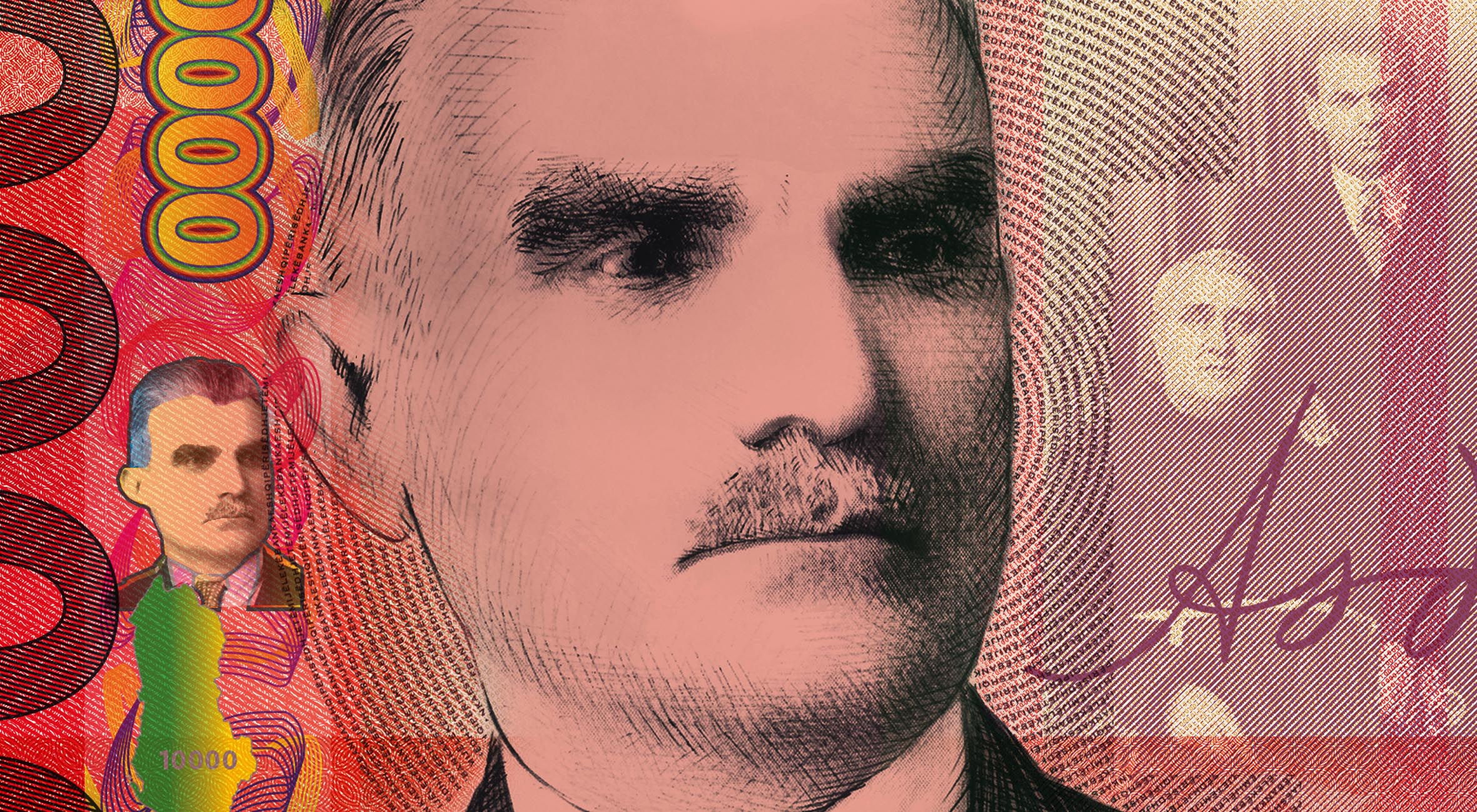
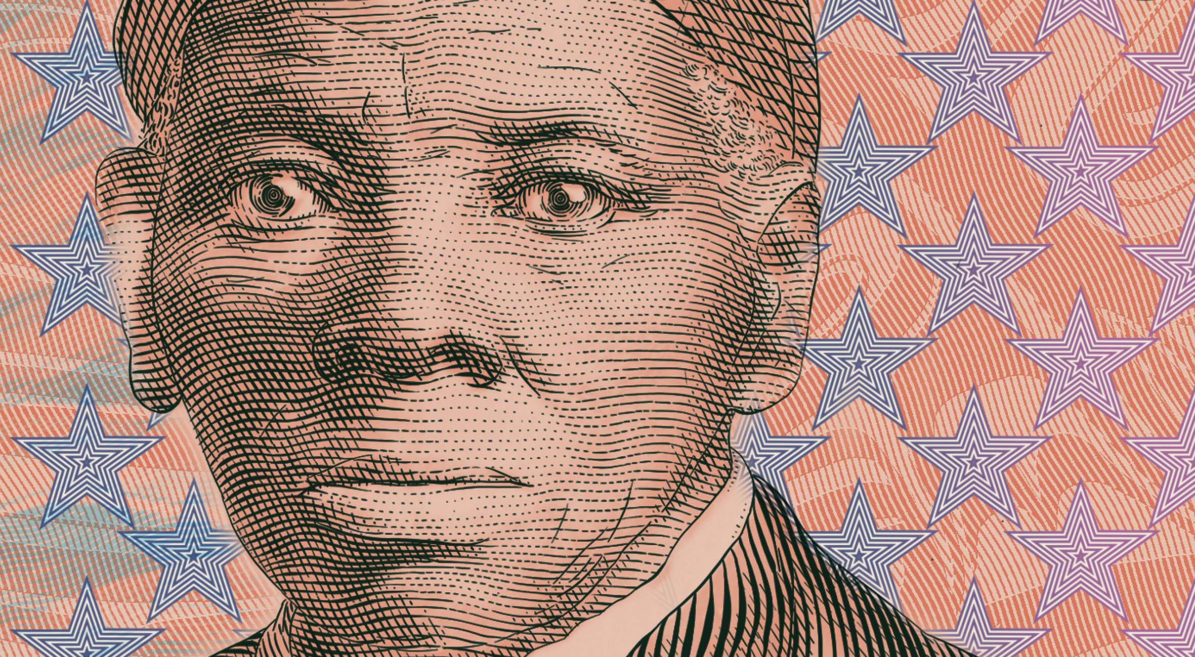
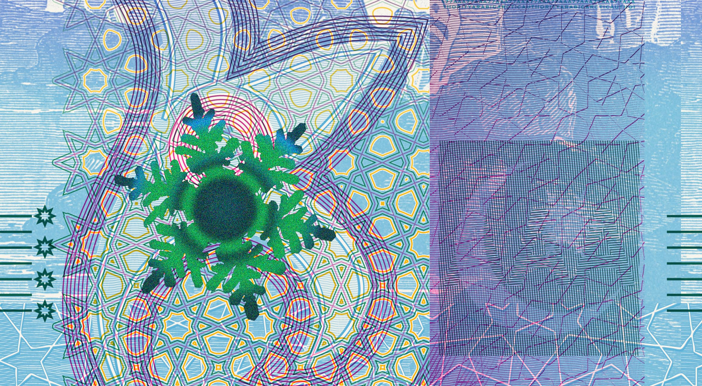
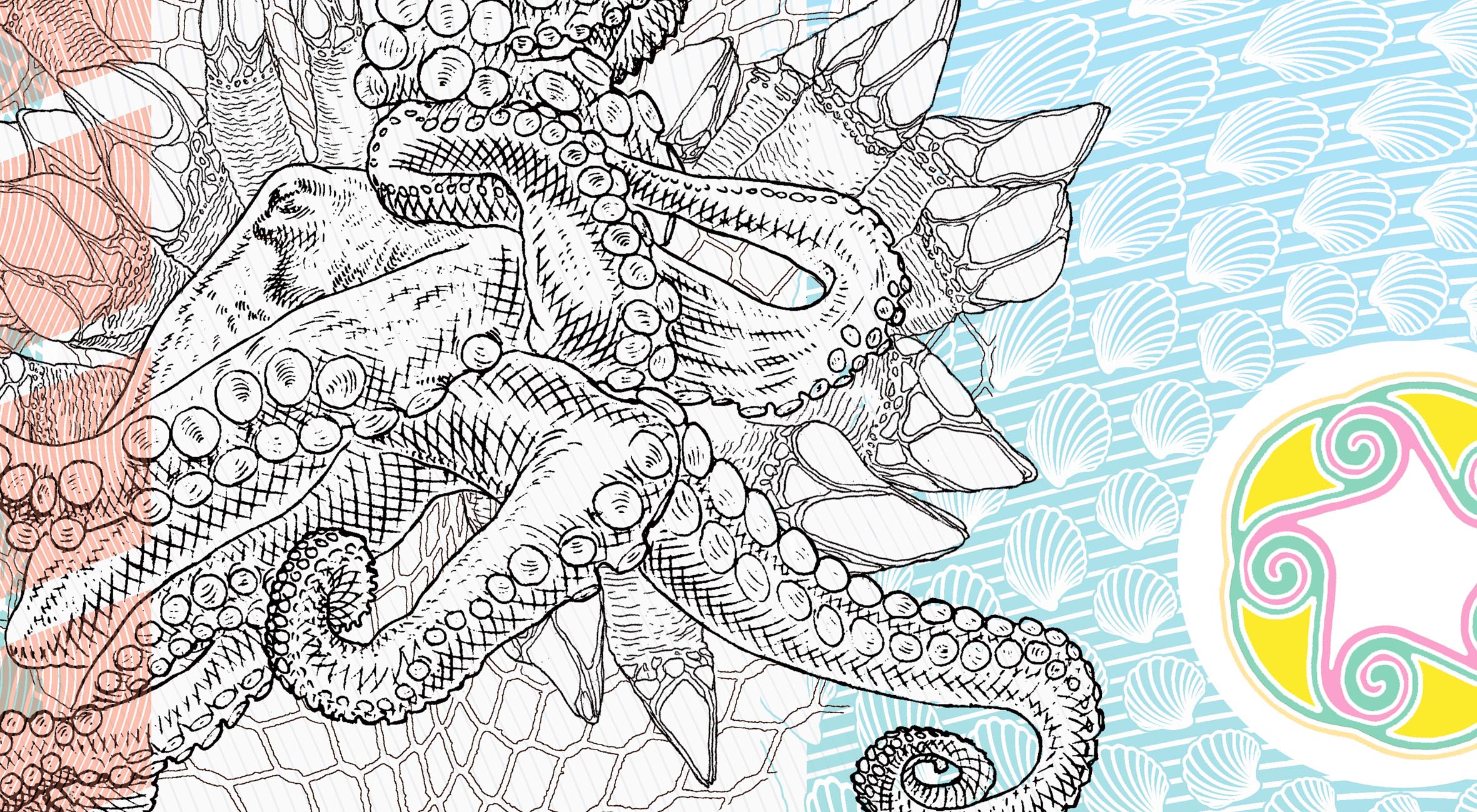
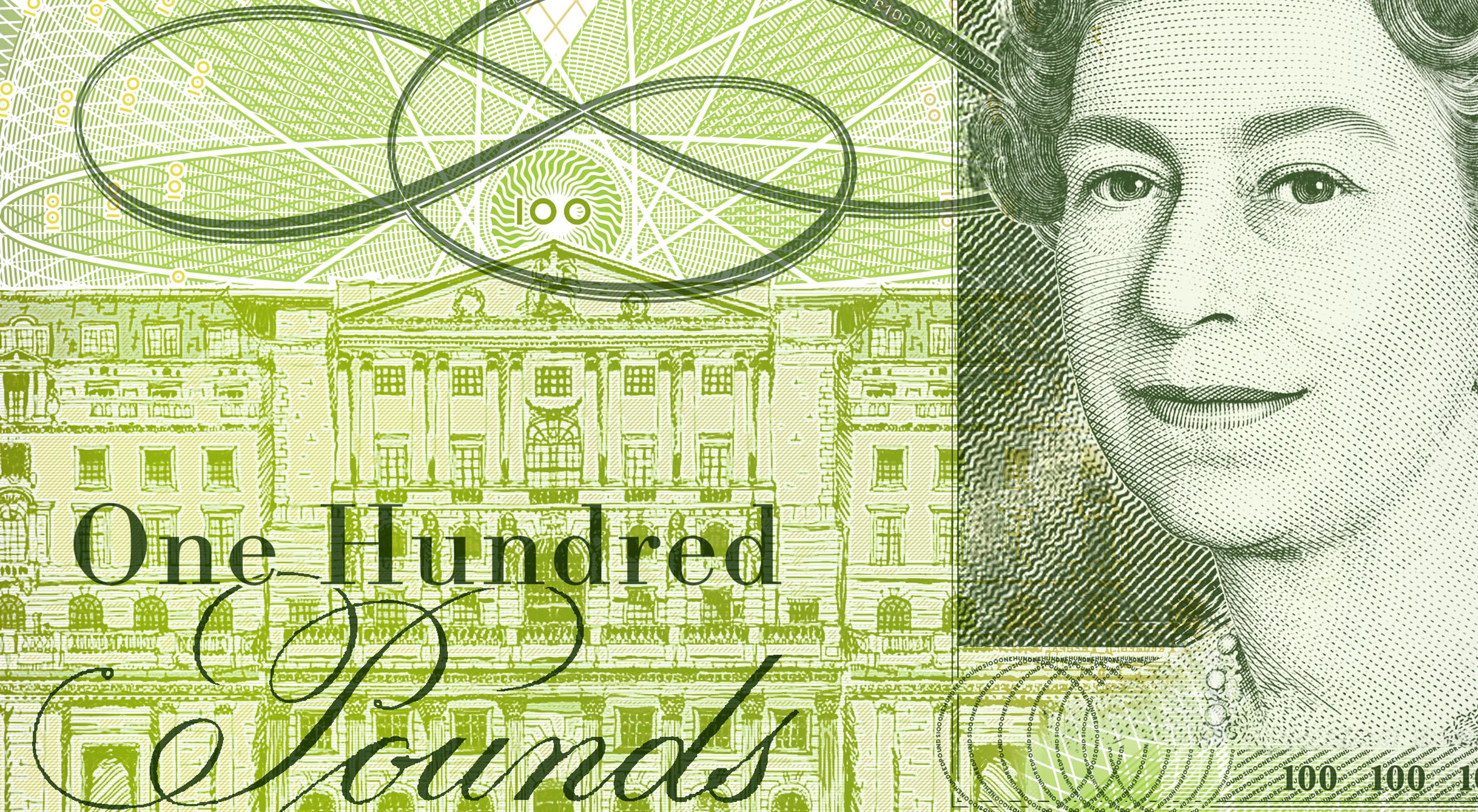
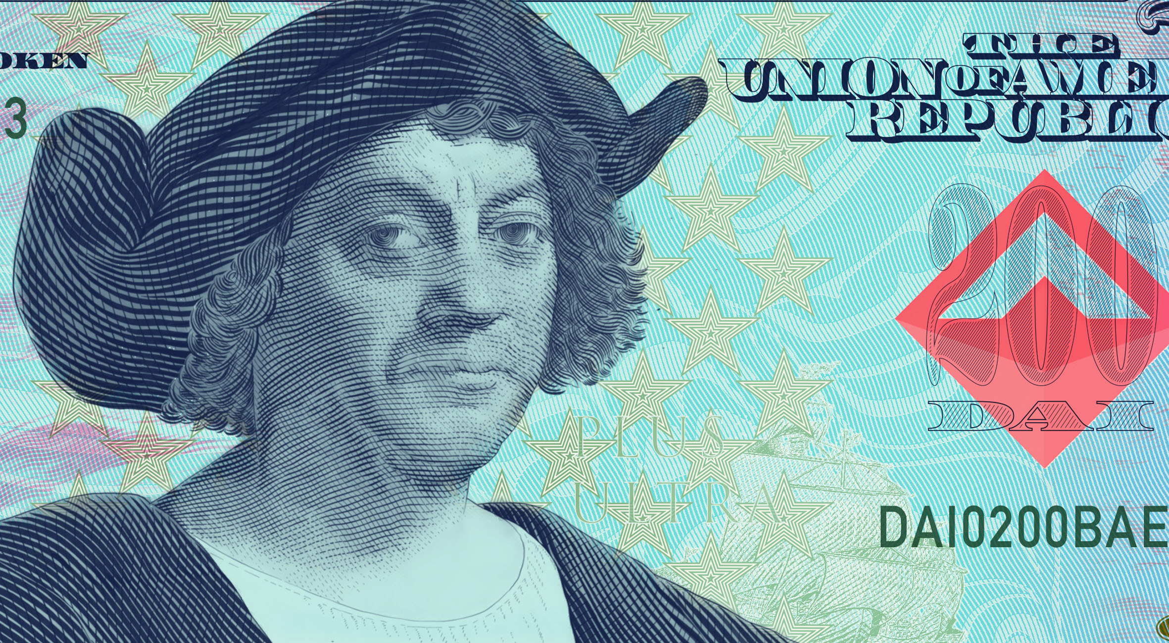
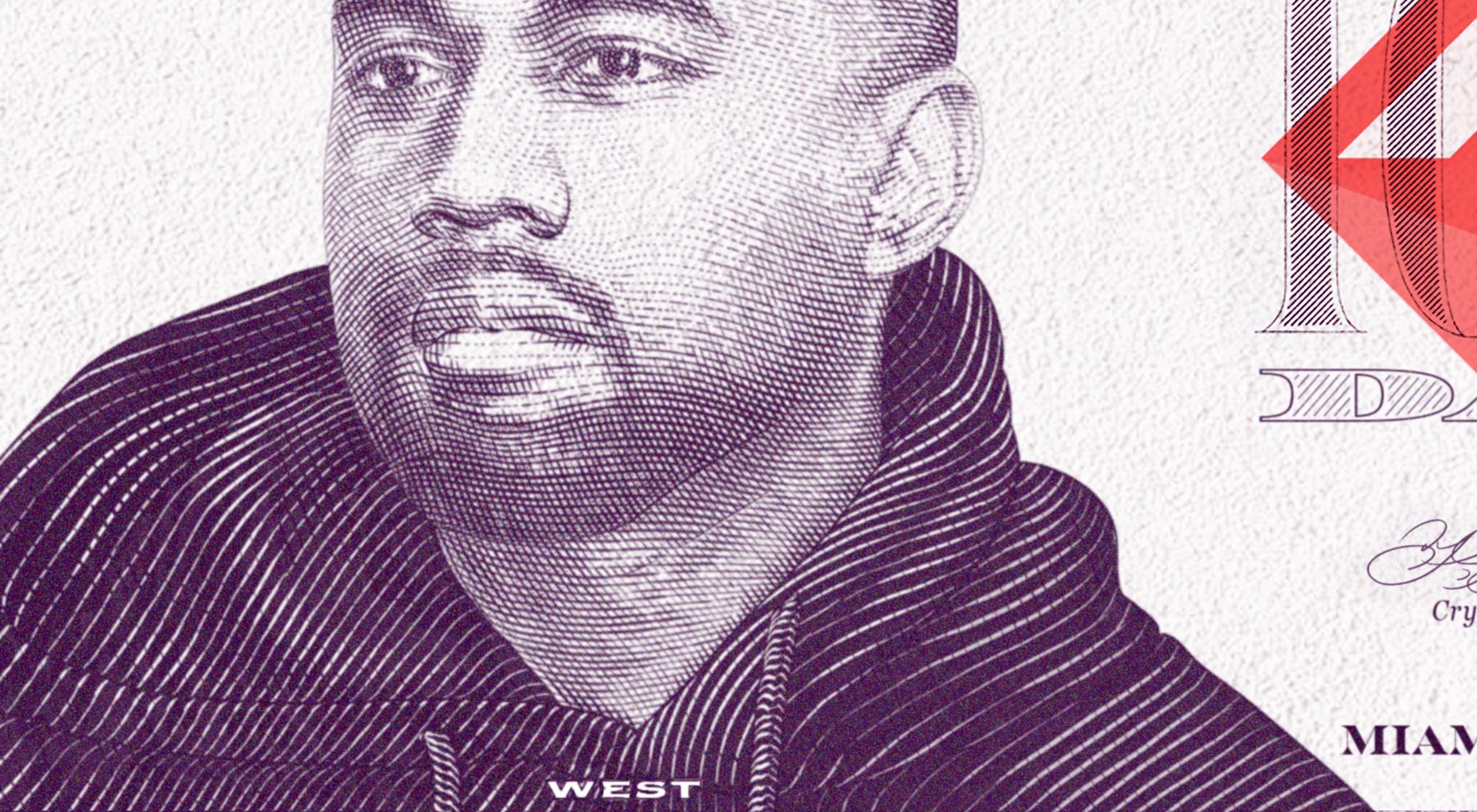
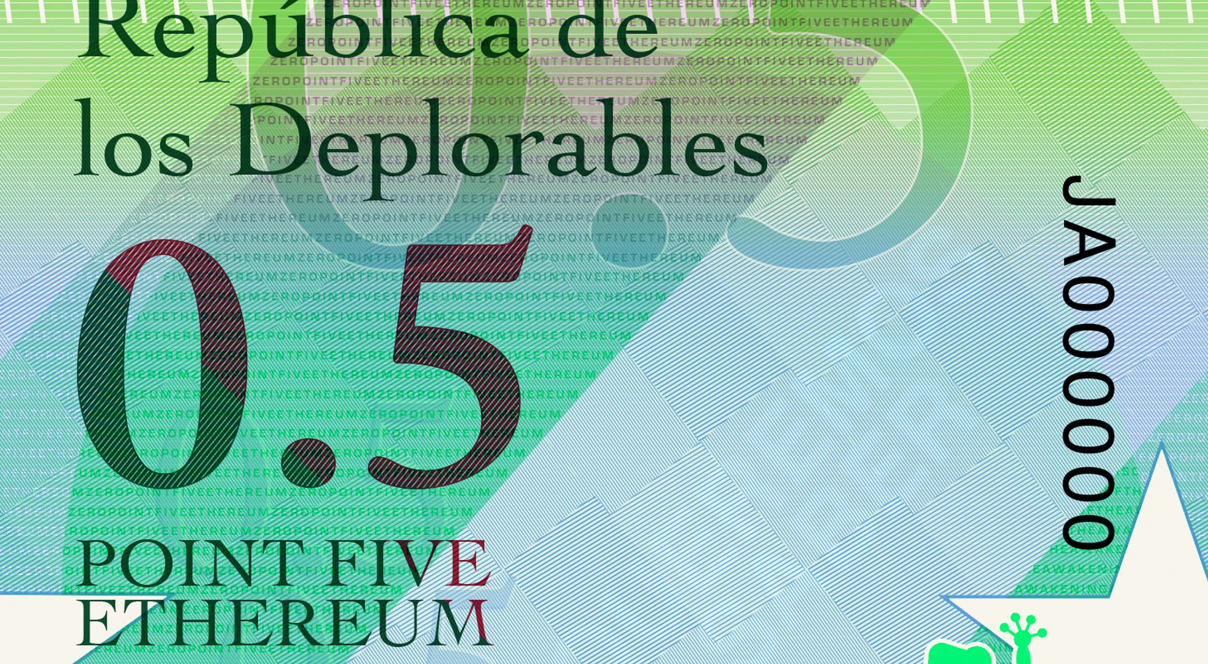
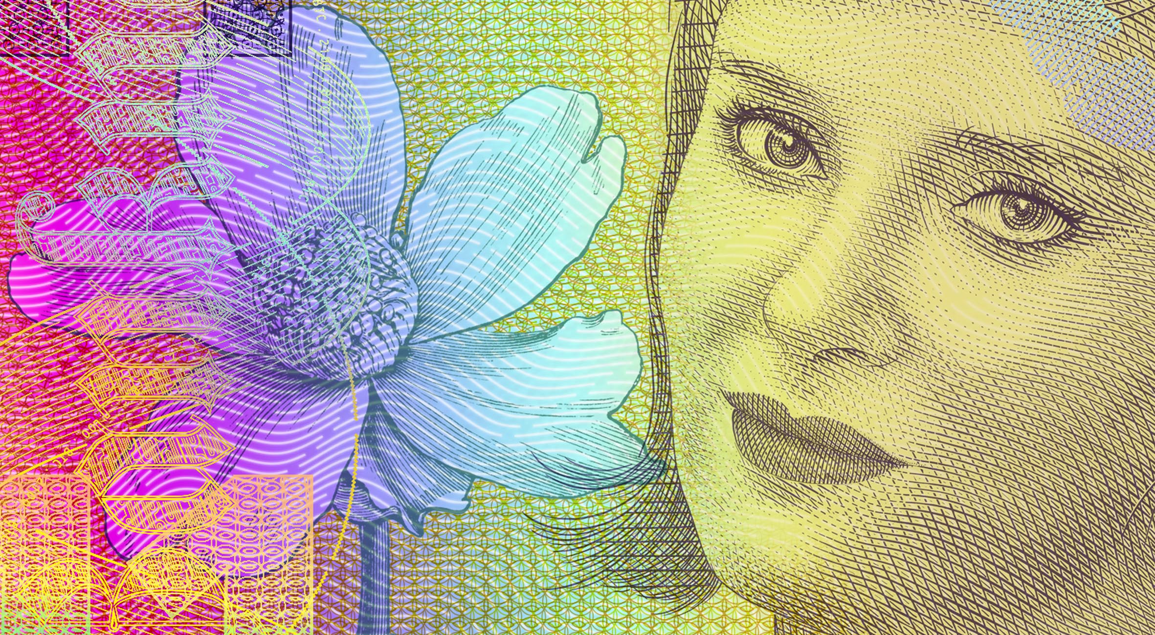
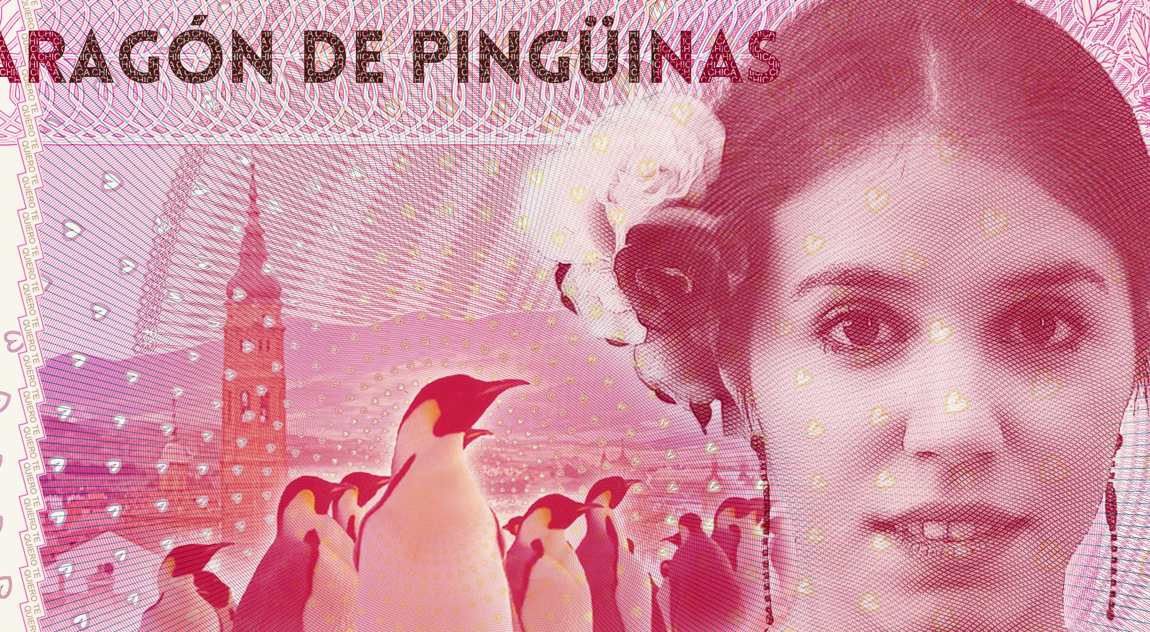
The experience of Brexit in the UK has progressed with extreme complexity. It has revealed fundamental polarities in the UK’s culture that cannot be easily reconciled. It has been a rallying cry to British identity – an identity which remains fluid and open to interpretation in the 21st century. Consequently, it is impossible to brand and design Brexit-related visual collateral without dialing into Britain’s rich visual identity. This banknote design, and others, are product of an investigation into the visual language of Brexit and British identity.
The Brexit phenomenon is a clarion call to reasserting a nation’s lost identity.

These designs draw heavily on present day Bank of England circulating notes, as well as past designs form a distant age. In doing so, they express a desire to ‘return’ – back to a simpler time, before a polarized, politicized culture.
This impulse is very real in the UK. In researching these designs, I discovered countless visual touch points – book covers, posters, graphic design – that all reference Brexit, through the visual language of 50s, 40s, 30s and even 20s English design.
British design sensibilities, and especially England’s, are anchored to nostalgia, which arises in times of uncertainty. In order to reinstate British identity, there is a need to return.
These designs draw on classic British design, from the Royal Mint, De La Rue, as well as celebratory chinaware. At the same time, the format is the modern polymer notes – the dimensions of these notes match the current £10.


