ONE HUNDRED POUNDS
A Speculative Design
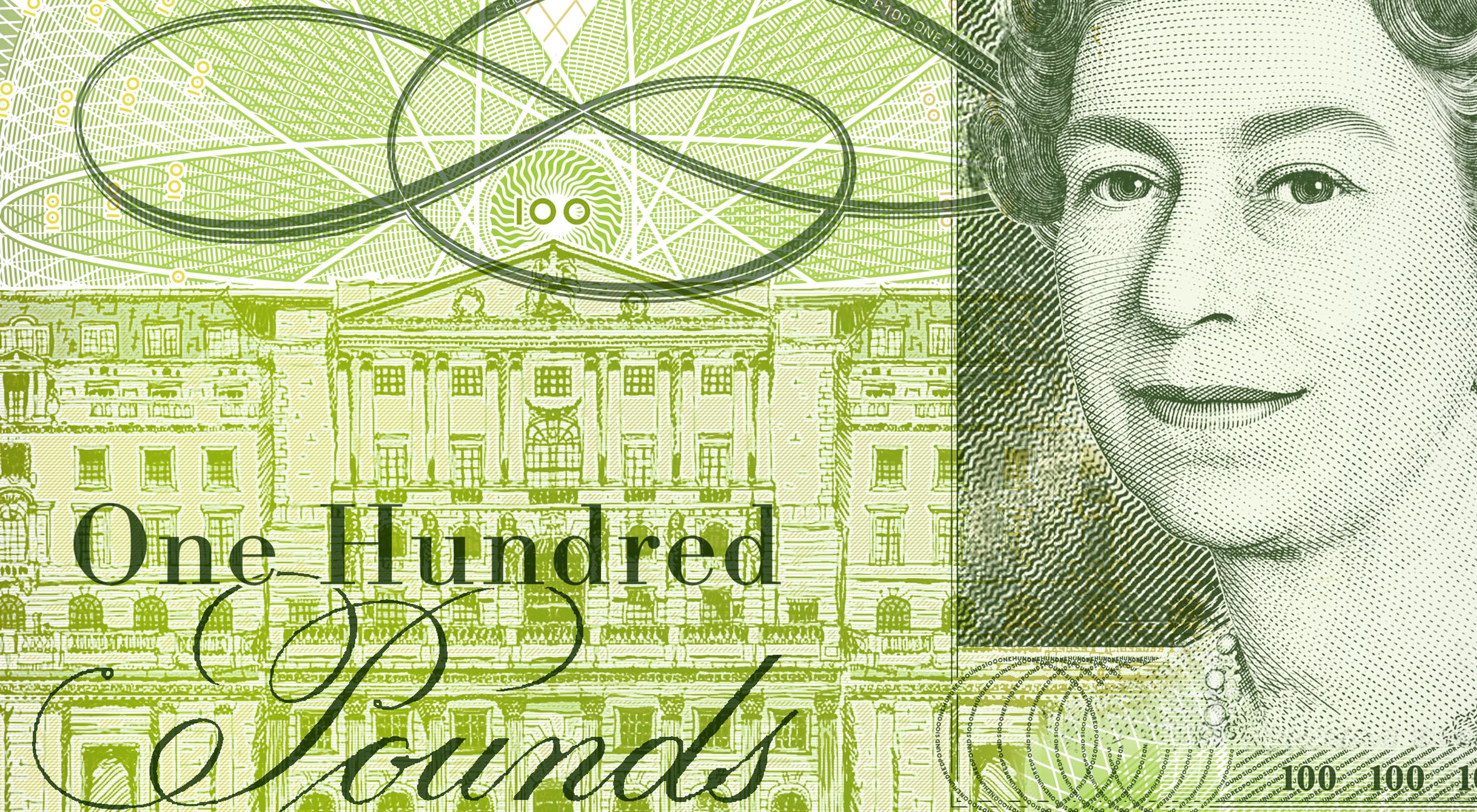
This speculative banknote was actually the first product of a long investigation into Brexit’s impact on design. The back of the note was a response to various attempts to redesign touch-points of British identity – such as the British passport and paper money. The iconic design of English banknotes often lend themselves to spoof, irony and poor-quality imitation. In contrast, this design represents a sincere affirmation of English identity.
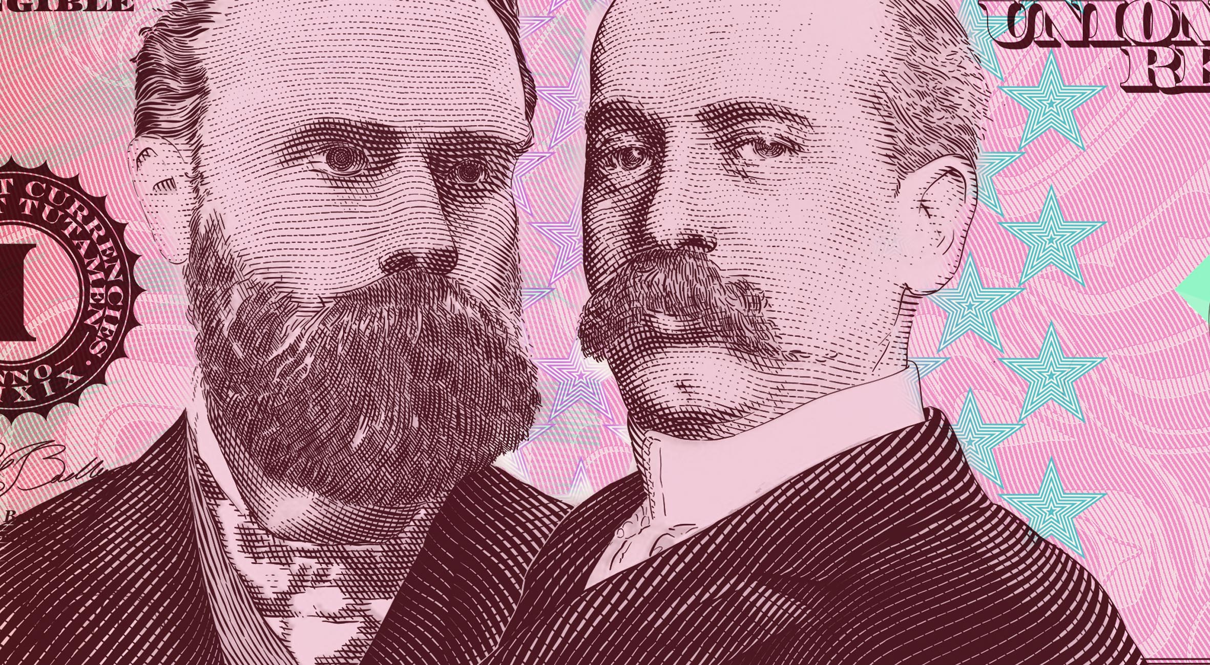
A print-ready speculative £100 note for the Bank of England.
The following was originally published on tombadley.net on April 24th 2017, and then published on Medium.com
Whenever there is a design brief that allows room for pastiche, there is always an opportunity to be disparaging and mocking. One competition from Dezeen recently asked people to redesign a post-Brexit passport. Obviously, Brexit is a binary issue, so a competition like this makes for strong, polarizing responses. Interestingly, the winning design was purposely ambiguous, much like — some would say — Britain’s future.
In designing the back of a £100, I wanted to avoid mocking, ambiguity, politics. It is a straight, sincere addition to the current British banknote family. No snide comment about inflation and the falling Pound. No wistful lament about Brexit. Just a straight up tribute to England’s past genius, and England’s legacy that continues to rule the world — the English language.
Samuel Johnson’s quote is long, but the liberal media, the protestors, the complainers — all those who cry victim and pray for someone else to sort it out — would do well to heed his words:
THE FOUNTAIN OF CONTENT MUST SPRING UP IN THE MIND, AND HE WHO HATH SO LITTLE KNOWLEDGE OF HUMAN NATURE TO SEEK HAPPINESS BY CHANGING ANYTHING BUT HIS OWN DISPOSITION, WILL WASTE HIS LIFE IN FRUITLESS EFFORTS AND MULTIPLY THE GRIEF HE PROPOSES TO REMOVE.

In considering the colors of the other notes in the Bank of England series, the color profile was changed to light green:


